BLOG 08
A practical guide for beauty brands, packaging teams and OEM or ODM projects
A successful cosmetic label has to work as brand communication, production artwork and regulated product information at the same time. The most reliable process starts with the real container, the intended decoration method and the target markets, then carries one approved information hierarchy through artwork, proofing and production. This guide explains how to make those decisions without treating a screen mockup as a production-ready label.
Introduction
Cosmetic labels fail when design, packaging and compliance are treated as separate handoffs. A label may look clean on a flat artboard but wrinkle on a tapered bottle, lose contrast over amber plastic, leave no room for a batch code or omit information required in the destination market. Direct printing creates a different set of constraints: the artwork must separate into printable colors, fit the container's printable area and tolerate normal registration variation on a three-dimensional surface.
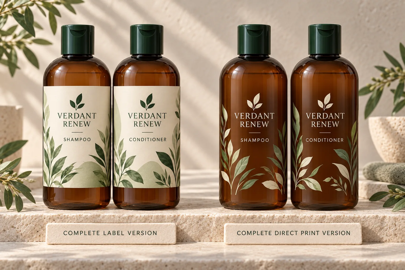
The practical goal is a controlled master design with production-specific versions. A sticker label and a direct screen-printed bottle can share the same logo, product hierarchy, typography and botanical graphics. They should not share the same production file, because their printable areas, color construction, seams, white layers and proofing methods are different.
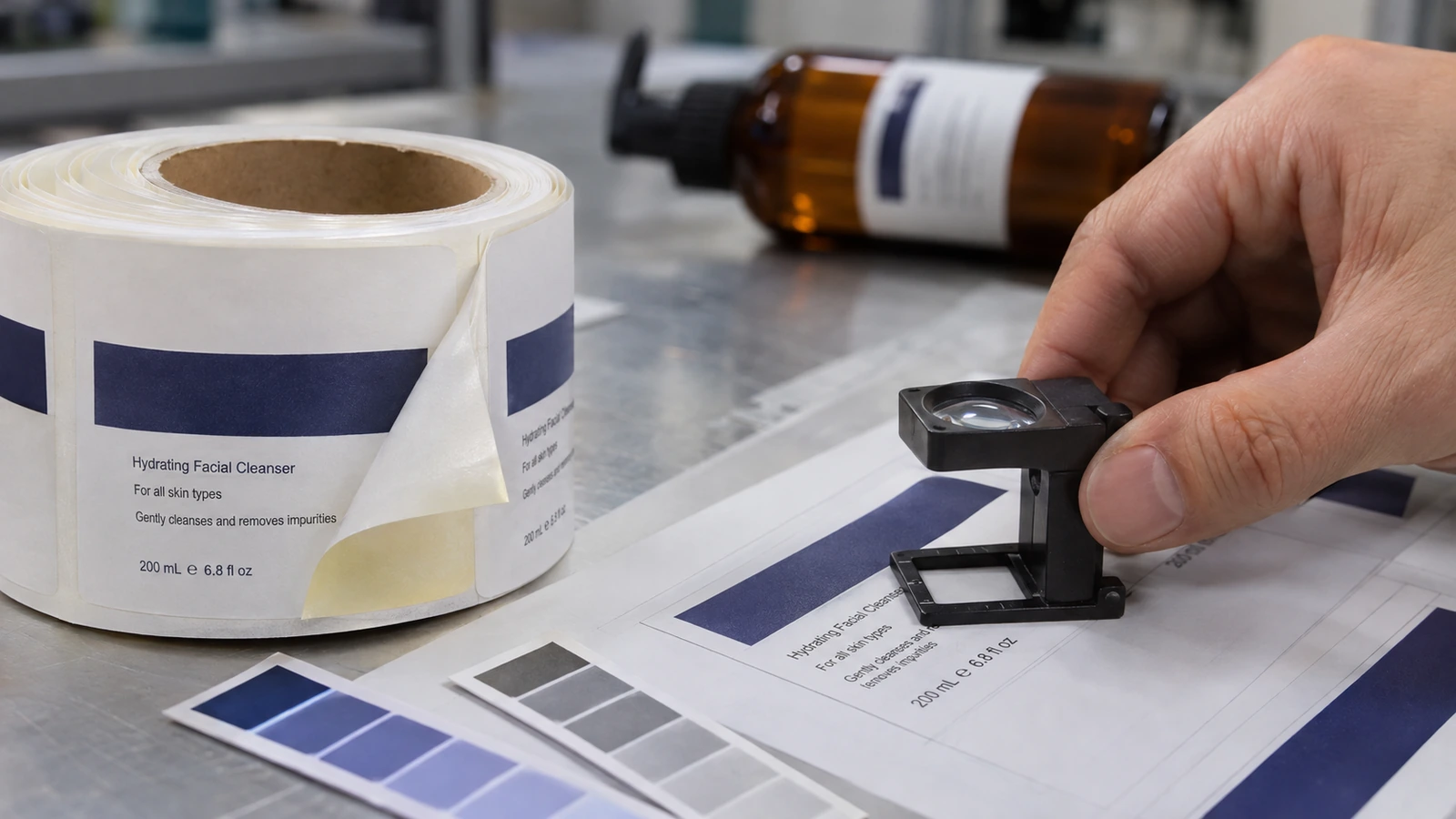
1 What Does a Cosmetic Label Need to Communicate?
A cosmetic label must help the buyer identify the product, understand how to use it and find the information required for a safe, traceable purchase. The exact legal fields and placement rules depend on the market, product category and pack configuration, but the design should reserve space for six types of information from the beginning.
- Product identity and function. State what the product is in language the intended customer can understand, such as shampoo, facial cleanser or body lotion. A brand name alone may not communicate the product's function.
- Variant and use cues. Make the range, scent, shade, hair or skin application, and rinse-off or leave-on use easy to distinguish without crowding the principal display panel.
- Net contents. Reserve the location and minimum legibility required by the destination market. Do not squeeze the declaration into whatever space remains at final artwork.
- Responsible business details and contact. The named entity, address and contact route must match the market's rules and the actual supply arrangement.
- Ingredients, warnings and directions. Use the required nomenclature, order, language and product-specific cautions. Keep sufficient room for formula changes and market variants.
- Traceability. Plan a stable, readable location for the batch or lot code and any date or period-after-opening information that applies.
The front panel should carry the fastest recognition tasks: brand, product identity, variant and the net content information required there. The information panel should carry the longer copy, ingredients, directions, warnings, responsible person details and traceability fields. This hierarchy is useful even when the pack is small, because it prevents decorative elements from competing with mandatory text.
Legibility is part of communication. Fine botanical linework, translucent inks and low-contrast palettes may look elegant on screen, but required information must remain conspicuous on the real substrate and under normal retail lighting. In the United States, FDA specifically addresses prominence, panel placement, contrast and minimum type sizes for certain statements. [1]
2 Sticker Labels vs. Direct Printing: Which Works Better?
Neither process is automatically better. Self-adhesive labels place printed graphics on a separate facestock that is converted and applied to the package. Direct screen printing deposits ink through a screen onto the container surface. The correct choice depends on the bottle material and geometry, design stability, number of variants, decoration area, filling line and the durability expected in use.
Practical process comparison
| Decision factor | Self-adhesive label | Direct screen printing | What to confirm |
|---|---|---|---|
| Graphics and color | Supports detailed graphics, fine screening and multiple finishes through the label converter. | Best for deliberate spot-color artwork, clean typography and graphics that suit screen separation. | Approved color targets, white ink strategy, overprint and visual tolerance. |
| Container shape | Works well on a defined label panel; tapered or compound curves may need a shaped dieline or more conformable film. | Requires a stable printable area and fixtures that hold the container consistently during decoration. | Actual bottle drawing, dimensional samples and decorated trials. |
| Design changes and SKUs | Separate label inventory can support more frequent copy, language or variant changes. | Decoration is tied more closely to the container and print setup; revisions require new production artwork and may require tooling changes. | Forecast by SKU, artwork change frequency and obsolete-material risk. |
| Edges and seams | The label edge or overlap can remain visible, especially with clear film or wraparound construction. | No label edge; artwork sits directly on the bottle, within the printable area. | Viewing angle, seam placement and whether a no-label appearance is essential. |
| Durability | Depends on facestock, adhesive, ink, laminate or varnish, product contact and wet-use exposure. | Depends on substrate treatment, ink system, cure and resistance to rubbing, water and formula contact. | Supplier tests on the actual filled pack and intended distribution conditions. |
| Variable information | Can be handled through label variants or selected digital label workflows. | Usually needs a separate coding step for batch, date or other variable data. | Code technology, code area, contrast and readability after line handling. |
| Proofing | Flat proof plus an applied label sample reveals color, edges, wrinkles and alignment. | A color drawdown and decorated bottle sample reveal opacity, registration and bottle interaction. | The physical approval sample and signed tolerance standard. |
For a coordinated range, treat the design system as the shared source and the production artwork as two controlled outputs. The label version should show its intended label construction honestly. The direct-print version should not hide a rear sticker or combine a printed front with a label back in a comparison that claims to show two complete methods.
3 Choosing Label Materials, Adhesives and Finishes
Material selection starts with the container and use environment, not a sample book. Confirm the bottle resin, surface energy, color, stiffness, panel shape and any mold-release residue with both the bottle supplier and the decorator. Then test the candidate label construction or ink system on production-representative containers.
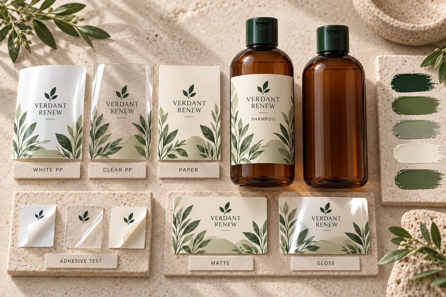
Facestock
Paper can support a tactile, natural appearance and accepts many print effects, but it may need a protective varnish or laminate where the product will be handled with wet hands. Film facestocks such as polypropylene, polyethylene and polyester are often selected for moisture resistance, clarity, conformability or dimensional stability. These material families include many grades; the polymer name alone does not establish whether a label is suitable for a particular bottle.
Adhesive
A permanent adhesive still has to match the pack. Review the bottle's surface energy, panel curvature, squeeze behavior, application temperature, storage temperature, wet exposure and possible contact with oils, surfactants or alcohol. Apply labels to the actual bottles, fill them with the intended formula or a validated simulant, condition them through the expected environment and inspect for edge lift, tunneling, bubbling, whitening and adhesive ooze.
Clear labels and white ink
A clear label can create a near no-label appearance, but the edge, adhesive and trapped air may remain visible. Transparent film also changes color perception because the bottle and product become part of the image. Light graphics on amber, green or colored plastic normally need a planned opaque white layer. Direct printing may need the same white-first logic, but the white separation and trapping must be built for the printer's ink sequence and registration capability.
Finishes
Matte and gloss finishes affect more than style. They change contrast, scuff appearance, tactile feel and the way dark colors read under bright light. Foil, embossing, texture varnish and cast-and-cure effects can be valuable on label stock, but each additional process must fit the dieline, artwork tolerances and converting route. Direct screen printing can create strong opaque spot colors and tactile deposits, but available effects depend on the decorator, ink system and bottle material.
4 Designing Artwork for Real Packaging and Printing
Production artwork should begin only after the pack specification is stable enough to define a real printable area. Request the bottle drawing, label-panel dimensions, taper and circumference, closure position, mold seams, orientation features and line-handling constraints. A rendered bottle mockup is useful for composition, but it does not replace dimensioned technical data.
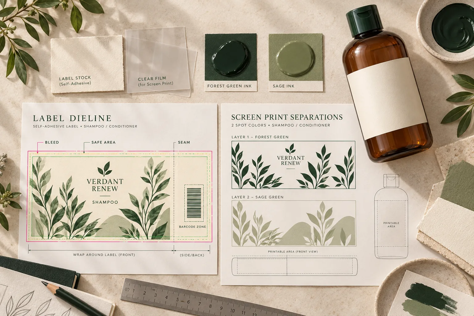
Build the file around production constraints
- Use the approved dieline. Keep trim, bleed, safe area, gap or overlap, seam and unwind or application direction on a non-printing technical layer.
- Protect curved and moving areas. Keep small type, rules and alignment-critical graphics away from shoulders, strong taper, mold seams, squeeze zones and closure interference.
- Separate technical colors. Identify CMYK, spot colors, white ink, varnish, foil and cut paths exactly as the printer specifies. Do not convert special plates into process artwork during handoff.
- Preserve usable source elements. Keep logos and line art as vector graphics where practical. Supply linked images at the resolution and color mode required by the printer, and manage fonts according to the agreed handoff standard.
- Reserve variable-code space. Give the batch or date code a flat, contrasting, scannable area that remains visible after filling, packing and abrasion.
- Verify machine-readable elements. Generate barcodes and QR codes from controlled data, follow the applicable symbology standard and verify the printed result on the finished pack. A successful phone scan of a screen preview is not a print-quality check.
Designing for direct screen printing
Ask the decorator for the maximum print width and height, number and order of colors, minimum positive and reverse line guidance, trapping approach, allowable registration variation, ink opacity, substrate-treatment requirements and curing method. These are supplier and pack-specific production parameters; do not copy universal minimums from another printer. Build a separate plate for every ink or coating and show the intended bottle color beneath the artwork during review.
Designing for self adhesive labels
Confirm the label shape, corner radius, gap or overlap, grain or machine direction where relevant, liner, unwind, core and application orientation. If the bottle is tapered, the dieline may need compensation to prevent a visibly rising edge. Clear labels need edge and adhesive evaluation; paper labels need wet-use and abrasion evaluation; squeezable packs need enough conformability to avoid darting or lift.
Proof the pack not only the PDF
A calibrated digital or contract proof can support color and content review, but it cannot reproduce every interaction between ink, label material, adhesive, bottle color and surface geometry. The release package should include a physical label applied to the final bottle or a decorated direct-print sample. Review it at arm's length, close range and under the lighting conditions relevant to production and sale.
5 Label Content and Market-Specific Requirements
Compliance should be a defined artwork release gate. A global master layout is useful, but the final copy, language, responsible business details, ingredient nomenclature, warning statements, symbols and date information must be approved for each destination market. The table below is a planning summary, not a substitute for product-specific regulatory review.
| Market | Core label planning points | Important current detail | Release owner should verify |
|---|---|---|---|
| United States | Identity and net quantity on the principal display panel; business name and place, required warnings, material facts and retail ingredient declaration on the information panel. Imported goods also require country-of-origin marking. | Under MoCRA, the cosmetic label must provide a domestic address, domestic phone number or electronic contact through which the responsible person can receive adverse-event reports. [1][2] | 21 CFR parts 701 and 740, product classification, ingredient names, warning rules, contact route and any drug-cosmetic overlap. |
| European Union and EEA | Article 19 covers the responsible person, country of origin for imports, nominal content, minimum durability or period after opening as applicable, precautions, batch reference, product function and ingredient list. Required text must be indelible, easily legible and visible. [3] | Since 31 July 2026, newly placed products must comply with the expanded individual fragrance-allergen labelling rules; qualifying legacy stock placed earlier may remain available until 31 July 2028. [4] | Responsible Person, CPNP status, language by member state, Annex restrictions, fragrance allergens, claims and final formula-to-label consistency. |
| Great Britain | The label must include the name and UK address of the Responsible Person, origin for imports, nominal quantity, durability or PAO information as applicable, precautions, batch reference, function and ingredients. Information must be easy to read and required information must be in English. [5] | The product must be notified through the Submit Cosmetic Product Notifications service before it is made available in Great Britain. [5] | GB Responsible Person, SCPN, English copy, ingredient and warning content, claims and any separate Northern Ireland route. |
| Canada | Plan for product identity, net quantity, dealer identity and principal place of business, contact information, ingredient list and applicable warnings or directions. English and French requirements apply to key information. [6] | Health Canada requires INCI ingredient labelling and has phased fragrance-allergen disclosure dates, including List 2 for new cosmetics from 1 August 2026 and existing products from 1 August 2028. [7] | Bilingual copy, INCI list, dealer details, net quantity, cautions, Cosmetic Notification Form data and current Hotlist status. |
Claims affect classification and evidence
Claims should be reviewed before the label architecture is locked. Words that suggest treatment, prevention or physiological action can move a product outside the cosmetic category or create additional requirements. Even when a claim remains cosmetic, it needs substantiation and must match the product's actual characteristics. Avoid treating a familiar marketing phrase as safe simply because it appears on competing products.
Ingredient copy must come from the final approved formula and the market-specific naming rules. A design team should not retype an ingredient list from a specification sheet. Use controlled text supplied or approved by the regulatory owner, then run a character-level comparison during final proof review.
6 From Artwork Draft to Final Print Approval
A clear approval route prevents late copy changes from bypassing technical checks. The following sequence works for both self-adhesive labels and direct decoration, with different physical proof requirements.
- Lock the input brief. Confirm product name, formula version, claims, pack size, container and closure, target markets, languages, decoration method and launch variants.
- Create the controlled copy deck. Assemble every required statement, responsible business detail, ingredient list, warning, direction, symbol and code placeholder. Give the copy deck a version number.
- Receive production specifications. Obtain the approved label dieline or direct-print area and the printer's artwork requirements before final composition.
- Build production artwork. Keep technical layers, spot colors, white plates, finishes and variable-code areas explicit. Produce separate files for labels and direct printing.
- Run parallel reviews. Brand reviews hierarchy and appearance; regulatory reviews content and market suitability; packaging and printer teams review construction, printability and line use.
- Approve a content proof. Compare the proof against the controlled copy deck and approved specification. Mark every change and reject untracked substitutions.
- Approve a physical proof. Use an applied label sample for the label route and a decorated bottle sample or agreed production drawdown for direct print. Check color, opacity, registration, edges, code area and handling.
- Release a golden sample. Sign and archive the final production file, color target, physical sample, tolerances and approval record. Production should compare against this controlled reference.
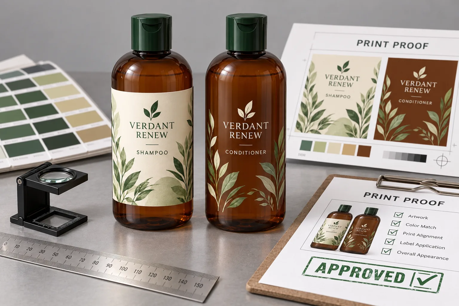
What the approval record should contain
- Final artwork filename, version, checksum or controlled document reference
- Approved copy deck and formula or ingredient-list version
- Container, closure, label construction or ink specification
- Color references and any agreed visual tolerances
- Approved physical sample or signed proof
- Names, roles and dates for brand, regulatory, packaging and production approvals
- Disposition of earlier versions so obsolete files cannot return to production
7 Common Label Design Mistakes and a Pre-Production Checklist
Common mistakes
- Designing before the pack is defined. A generic rectangle rarely survives real taper, seams, squeeze zones and closure geometry without compromise.
- Using one production file for two decoration methods. The brand system can remain consistent, but label dielines and screen-print separations need different technical construction.
- Approving only a front render. This hides seam placement, information-panel crowding, code location and the difference between a complete decoration method and a hybrid mockup.
- Treating small type as a layout solution. Legibility, minimum type rules and normal manufacturing variation should define the copy hierarchy.
- Ignoring the filled product. Bottle color, formula color, panel distortion and squeeze behavior can change opacity, contrast and adhesion.
- Leaving compliance until final art. Late ingredient, warning or responsible-person changes can force a new hierarchy and another proof cycle.
- Approving color on an uncalibrated monitor. A physical reference is necessary when opacity, spot color, bottle color and finish affect appearance.
- Forgetting the production code. A batch code needs a defined area, process, contrast and verification step; it should not be added over critical copy after design approval.
Pre production checklist
[ ] The final bottle, closure, capacity and pack drawing match the artwork brief.
[ ] The decoration method is identified for every SKU: self-adhesive label or direct print.
[ ] The current supplier dieline or direct-print area is used without unapproved resizing.
[ ] Bleed, safe area, seam, gap or overlap, orientation and non-printing technical layers are correct.
[ ] Every color, white plate, varnish, foil or cut path is named and separated as the printer requires.
[ ] Small type, fine lines, reverse text and trapping follow the selected printer's confirmed capability.
[ ] Front-panel identity and required quantity information are present and correctly positioned for the market.
[ ] Responsible business details and the consumer contact route are accurate for the destination market.
[ ] The ingredient list matches the released formula and market-specific naming rules.
[ ] Warnings, directions, symbols, durability or PAO information and country of origin are verified where applicable.
[ ] Claims have been reviewed for classification, accuracy and supporting evidence.
[ ] Required languages are complete and consistent across the container, carton and inserts.
[ ] The batch or date code area is clear, flat enough, contrasting and compatible with the coding process.
[ ] Barcodes and QR codes contain controlled data and have been verified on a printed finished pack.
[ ] A label adhesion and wet-use test has been completed on filled, production-representative bottles when labels are used.
[ ] Ink adhesion, cure, rub resistance, opacity and registration have been checked on the production bottle when direct printing is used.
[ ] A physical applied-label or decorated-bottle proof matches the approved content and color targets.
[ ] Brand, regulatory, packaging, procurement or supplier, and production approvals are recorded.
[ ] The released file is archived and obsolete artwork has been removed from active production locations.
Frequently Asked Questions
What is the best label material for shampoo bottles?
There is no universal best material. A moisture-resistant film is often considered for wet-use bottles, while protected paper may be chosen for a tactile look. The correct construction depends on the bottle resin and shape, squeeze behavior, application conditions, adhesive, ink, finish, formula contact and distribution environment. Test the complete construction on the actual filled pack.
Can the same artwork be used for labels and direct screen printing?
The same brand hierarchy and design system can be used, but the production artwork should be separate. A label file needs a dieline, bleed, seam and converting instructions. A screen-print file needs a defined bottle print area, one separation per ink or coating, and printer-specific trapping, opacity and registration decisions.
Are clear labels the same as direct printing?
No. A clear label still has a facestock, adhesive and edge, even when the construction creates a near no-label appearance. Direct printing places ink on the container and has no label seam, but it is limited by the printable area, ink system, color count and container-handling process.
How small can cosmetic label text be?
Use the legal minimums that apply to the market and statement, then check practical legibility on the physical pack. The United States, for example, specifies minimum sizes for ingredient declarations, net contents and certain warnings. Other markets use their own rules and general legibility standards. Printer capability is not a substitute for regulatory legibility.
Do cosmetic products always need an expiration date?
No single rule applies worldwide. In the EU, Article 19 uses a date of minimum durability for products with durability of 30 months or less and a period-after-opening indication for many products with longer durability, subject to the regulation's conditions. U.S. cosmetics do not generally carry a universal expiration-date requirement, although product-specific rules and safe-use facts may apply. Confirm the requirement for the exact market and product.
Does every ingredient have to fit on the bottle?
Placement options vary by market and pack configuration. Some rules allow the ingredient list on outer packaging, an attached tag or an enclosed leaflet in defined circumstances, while other required information must remain on the immediate container. Do not remove or relocate copy based only on available space; confirm the permitted route first.
How should color be approved?
Use a defined color reference, a suitable proof and a physical sample on the real material or bottle. Review spot-color drawdowns, opaque white, laminate or varnish, bottle color and filled-product appearance under agreed lighting. Record the approved sample and any tolerances that production will use.
When should a brand choose direct screen printing?
Direct printing is a strong option when the container, design and color system are stable, the bottle offers a suitable printable area and the brand wants graphics with no label edge. A self-adhesive label can be more adaptable when the range needs detailed graphics, frequent copy changes, many market versions or special label finishes. The supplier should confirm the technical and commercial fit for the actual project.
Conclusion
Good cosmetic label design is a controlled production system. The visual idea must survive the bottle shape, label construction or direct-print process, filling line, wet-use environment and the information rules of every destination market. Starting with real specifications and ending with a signed physical sample protects the design and reduces late artwork changes.
If you are developing a shampoo, conditioner, skin-care or body-care range, an experienced OEM or ODM partner can coordinate formula data, bottle and closure selection, label or direct-print suppliers, sampling and production release. Share the target markets, pack format, decoration preference, claims and launch quantities early so the packaging route can be evaluated before final artwork begins.
Official References
1. U.S. Food and Drug Administration, Cosmetics Labeling Regulations. https://www.fda.gov/cosmetics/cosmetics-labeling/cosmetics-labeling-regulations
2. U.S. Food and Drug Administration, Guidance for Industry Registration and Listing of Cosmetic Product Facilities and Products. https://www.fda.gov/media/170732/download
3. EUR-Lex, Regulation EC No 1223 2009 on Cosmetic Products current consolidated version. https://eur-lex.europa.eu/legal-content/EN/ALL/?uri=CELEX:32009R1223
4. European Commission, Fragrance Allergens Labelling. https://single-market-economy.ec.europa.eu/sectors/cosmetics/cosmetic-products-specific-topics/fragrance-allergens-labelling_en
5. GOV.UK, Making Cosmetic Products Available to Consumers in Great Britain. https://www.gov.uk/guidance/making-cosmetic-products-available-to-consumers-in-great-britain
6. Health Canada, Labelling of Cosmetics. https://www.canada.ca/en/health-canada/services/consumer-product-safety/cosmetics/labelling.html
7. Health Canada, Industry Guide for the Labelling of Cosmetics. https://www.canada.ca/en/health-canada/services/consumer-product-safety/reports-publications/industry-professionals/labelling-cosmetics.html
8. International Organization for Standardization, ISO 22715 Cosmetics Packaging and Labelling. https://www.iso.org/standard/36436.html
Sources reviewed 23 October 2026. Regulatory requirements change; confirm the current official text and product-specific advice before artwork release.